Have you ever wondered what goes into creating a logo that reflects both professionalism and approachability?
When we first started shaping SG Law Guru, we knew it had to be more than just a name or a platform. It needed to represent a philosophy — that legal understanding should feel relatable, practical, and within reach. This belief needed a face, or rather, a symbol that carries both wisdom and warmth.
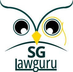
At the heart of the logo is an owl, long known for wisdom and vigilance. But this is no ordinary owl. Take a closer look, and you’ll see subtle details that tell a deeper story. Its beak forms the pivot of a scale that represents fairness and balance. The monocle adds character and curiosity — a reminder that clarity often begins with a closer look. Together, they personify what SG Law Guru hopes to achieve: expertise with empathy, and insight with integrity.
The design process took patience and reflection. We explored color tones, proportions, and typography until everything felt balanced. The deep green symbolizes trust and professionalism, while the subtle gold of the monocle brings warmth and guidance. It is akin to a small light leading the way in a complex world of rules and words.
Every mark in this logo has a purpose. It reminds us that guidance should enlighten, not intimidate — the law, at its best, is about understanding, fairness, and humanity.
This is the story behind our logo. It’s a story of clarity, connection, and care. We hope it resonates with you as much as it does with us.
Follow SG Law Guru for more insights and perspectives that make the law a little easier to understand.

📷 Image by jplenio from Pixabay